Cookbook: Customizing node visuals
The visual appearance of nodes can be modified to better fit specific usecases. This chapter assumes you have creates custom node viewmodels as is explained in “Creating custom node types”.
Replacing the view
In your node viewmodel class, you should have added a line that specifies its matching view class.
static HelloWorldNode()
{
    Splat.Locator.CurrentMutable.Register(() => new NodeView(), typeof(IViewFor<HelloWorldNode>));
}
Here new NodeView() specifies that the default NodeView is to be used.
To modify the appearance of the node, create a new UserControl to be used as the replacement node view.
Then, replace new NodeView() with your own new view class.
<UserControl x:Class="Example.HelloWorldNodeView"
             ...
             >
    <views:NodeView x:Name="NodeView"/>
</UserControl>
public partial class HelloWorldNodeView : IViewFor<HelloWorldNode>
{
    #region ViewModel
    ...
    #endregion

    public HelloWorldNodeView()
    {
        InitializeComponent();

        this.WhenActivated(d =>
        {
            this.WhenAnyValue(v => v.ViewModel).BindTo(this, v => v.NodeView.ViewModel).DisposeWith(d);
        });
    }
}
In the previous snippet, I left out the ViewModel property for clarity and brevity of the example. Its declaration is a piece of boilerplate ReactiveUI code to create a WPF property that holds the ViewModel. It looks like this:
public static readonly DependencyProperty ViewModelProperty =
        DependencyProperty.Register(nameof(ViewModel), typeof(HelloWorldNode), typeof(HelloWorldNodeView), new PropertyMetadata(null));

public HelloWorldNode ViewModel
{
    get => (HelloWorldNode)GetValue(ViewModelProperty);
    set => SetValue(ViewModelProperty, value);
}

object IViewFor.ViewModel
{
    get => ViewModel;
    set => ViewModel = (HelloWorldNode)value;
}
NodeView properties
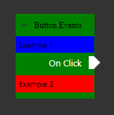
In your new node view class, you can now set several properties on the NodeView object.
<views:NodeView x:Name="NodeView"
                TitleFontFamily="Times New Roman" TitleFontSize="13" Background="Green" Foreground="Black"
                ArrowSize="9" CornerRadius="0">
    <views:NodeView.LeadingControlPresenterStyle>
        <Style TargetType="ContentPresenter">
            <Setter Property="ContentTemplate">
                <Setter.Value>
                    <DataTemplate>
                        <Label Background="Blue">Example 1</Label>
                    </DataTemplate>
                </Setter.Value>
            </Setter>
        </Style>
    </views:NodeView.LeadingControlPresenterStyle>
    <views:NodeView.TrailingControlPresenterStyle>
        <Style TargetType="ContentPresenter">
            <Setter Property="ContentTemplate">
                <Setter.Value>
                    <DataTemplate>
                        <Label Background="Red">Example 2</Label>
                    </DataTemplate>
                </Setter.Value>
            </Setter>
        </Style>
    </views:NodeView.TrailingControlPresenterStyle>
</views:NodeView>